bait & switch - a postmortem
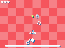
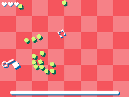
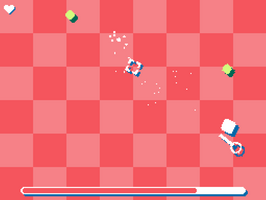
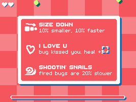
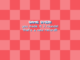
As of writing this, there's about an hour until the jam ends, and my game "bait & switch" will have been submitted for around 12 hours. Before the judging commences and I dive head first into playing as many games as I can fit into my Downloads folder, I thought I'd take a moment and reflect on the process of making "bait & switch," the decisions made along the way, why I submitted 12 hours early, and why I'm taking so much pride in this project.
The Theme
God I hated this theme. Maybe it's because my original interpretation was very narrow, or maybe it's PTSD from almost 10 Ludum Dare's, but I despised this theme when it was announced. I mean, c'mon, "oh no, it's loose"? There was no way I could come up with a game for this theme that makes sense. What was I gonna do? My original ideas surrounded a thief stealing a cat or an apocalypse survivor tripping over their shoelaces while escaping a hoard of enemies. A little miffed, I binged a few episodes of The Bear with The Girlfriend, and headed to bed for the night.
David Byrne, My Savior
Rolling out of bed Saturday morning, I was immediately swamped with the thought of the theme again. I had promised myself that I'd truly commit to this jam, after months of flaking on games based on self-inflicted "burnout." I had a few ideas scratched onto the window in dry-erase, but nothing that really stuck with me (as of writing this, these ideas are still on my window. I have no intention of wiping them off). I plopped myself into my chair, booted up my computer, and began my daily ritual of iced coffee and YouTube. I had ended up watching an interview with David Byrne of the Talking Heads, and his feelings around creating music. Now, I can't for the life of me find the interview, nor the quote, but he was talking about the idea that songs "need" to have a message behind them, that there just *has* to be some sort of deeper meaning. He said it was bogus! That the creation and the production of the music itself sparked enough joy, there didn't need to be some deeper concept enriched into it! I booted a new Gamemaker project up and got to work.
The Breaking of the Grid
I had instinctively opened Aseprite and drew out a grid. This had been my starting point for games for years now, an old school grid-based movement system, similar to that of Rogue or even modern titles like Loop Hero or Kingsway. But once again, I had struggled with trying to make this theme fit. I had a rough idea in mind at this point: you catch bugs with a net. What you do with them or how you catch them was beyond me at this point, but it was a start. I thought of doing a Sokoban style puzzle game like stevenjmiller, or a 3/4 topdown game like Robin Field, but I ended up with something much simpler and much more organic. First, I dropped a square on the grid, and rounded the corners. I added a dropshadow, and added some pixelated rendering that that of a kindanice game. I then added sprite rotation, like... a kindanice game. I had been playing a lot of kindanice games, and their style was influencing me pretty heavily. I threw a net next to my player, a cursor on the screen, and at 10:28am, posted this video to the Mount Royal University Game Design and Development Club Discord: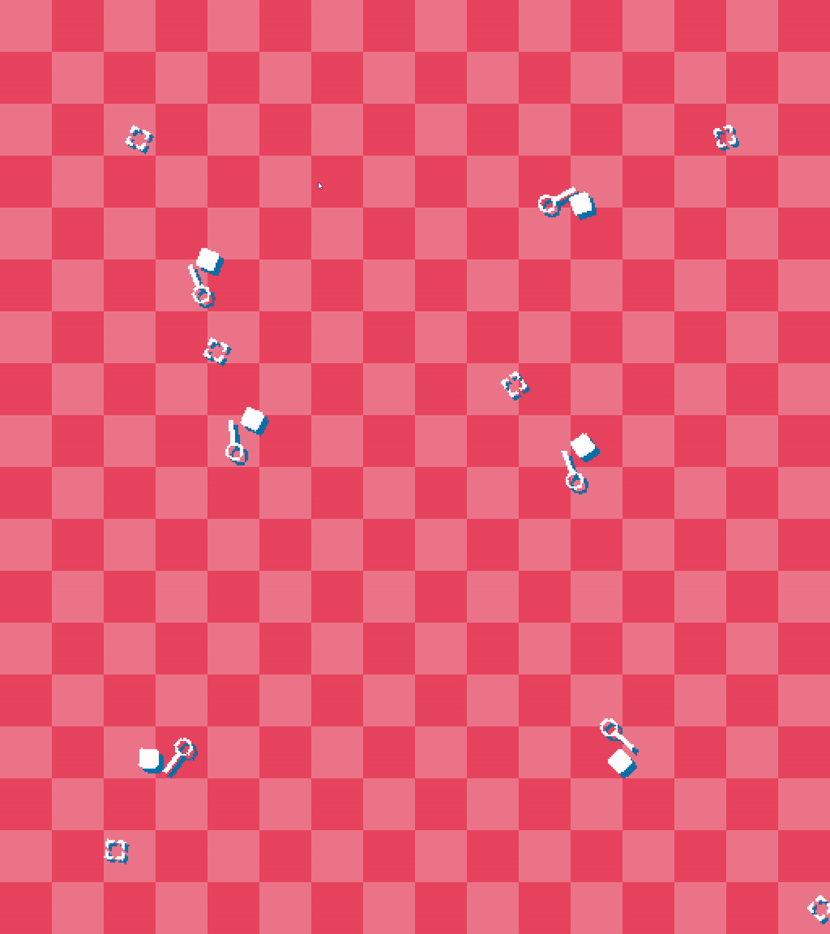
Bugs
I loved the idea of catching bugs, but couldn't figure out where I wanted to go from there. Was I making a collection? If so, why would the bugs being loose be an "oh no"? Was I killing them? If so, why the net? I eventually settled on a kind of backstory for the game, where you're out catching bugs, and accidentally catch a bug that... alerts all its friends? That then swarm and attack you? No idea, there's a reason there wasn't a cutscene in the beginning. ANYways, I loved the idea of bugs suddenly flying at you, and the only thing you have to defend yourself... is a bug, that you then launch into the other bugs like a catapult. An hour and a half later: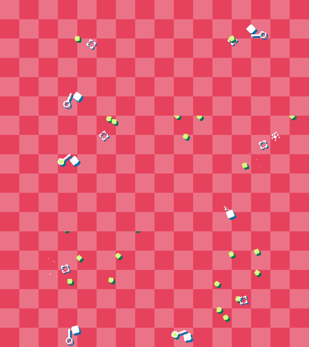
Some fun notes on this version:
- The cursor goes *behind* the first bug
- The spawning is twice as fast as the final version
- No trail on the thrown bugs
- Bugs never despawned and I never died, so the game started lagging real badly after 5 minutes of this in the background.
The Curse of the Roguelike
I'll tell you now, this version was pretty fun. Risking running up to grab a bug to then bolt back and sling it right at them was a blast, and I was loving the way this was turning out. Now, as I added hearts and started spawning more enemies, the fun began to dwindle. The AI isn't anything fancy (legally I don't even think I can call this AI, let along pathfinding), but with too many enemies and your bugs only being so small, the game gets hard fast. Any tweaking to the spawn rates or the projectiles felt.. weird, and made the game less fun. I needed to add some form of progression, something to keep it fresh. I needed some choice.
I had just finished playing Daniel Mullins' game Inscryption and had loved the choice that you had in that game. Three selections of cards that you'd already seen, time and time again, but that had the power to be combined and used together in some crazy synergy. I threw a new Aseprite file open, made around 8 icons for possible upgrades, and began adding them in. There's actually a handful that didn't make the jam submission, like "the first killed bug blows up," or "killed bugs shock nearby bugs," or even something as simple as split-shot, just because they didn't feel simple enough. I needed a feeling of balance to the project, and those upgrades didn't feel vanilla in a way. I moved on with 5, and began adding polish.
The Final Day... For Me
It's still Saturday, getting late, and I gotta be up for work at 6:00am the next morning, then out to Cochrane to help a family member move... I did not want this thing on my plate any longer. I had scrapped the cutscene earlier in development, so it was time to keep chopping. Bosses? Gone. Enemy types? Like beetles or locusts? Gone. Story, in any sense? Gone. Music? Gone.
I had around three hours left in the day where I'd be... functional? So I spent the first bit finishing up some additional assets. Tutorial icons, Itch page, logo, Windows test build, web test build (was gonna buy Gamemaker web exports for this, but Gamemaker gave it to me for free, thanks Gamemaker!), whatever needed to be done.
The next bit was polish. Particle trails, hover effects on the upgrades, some performance things here and there. All those little decorative bits were all polish.
The final bit of development was that pesky progress bar at the bottom of the screen. I spent so long putting it off because I could not find a nice spot to put it! I tried up top, but it covered up the enemies... The sides looked weird... A counter was just gross... The bottom was the least bad option.
Finally, at 10:11pm that same Saturday, I posted my Itch link in the AGJ Discord, and logged off for the night.
Bugs (the code kind)
Rolled over the next morning with around two hours 'till work, and around 30 Discord messages from friends and playtesters, pointing out some critical bugs. Specifically, a crash on the second playthrough, and a late game break that almost guarenteed death. After some coffee, a shift, and a quick call to a family member that I'd be late, I had published a patch. Phew.
Lessons
Honestly, I had a ton of fun this jam. It was great to hop back into Gamemaker, break out of my comfort zone, and make something that looks as cool and feels as good as it does. I had been previously putting off diving back into Gamemaker, out of concerns that the engine wasn't "object oriented" enough, or wasn't "professional enough". Honestly, picking it back up and refamiliarizing myself with it was like meeting and old friend you hadn't seen for a while. An old friend, with like, a kickass beard and rock hard abs - Gamemaker's got some sweet new features! Gonna have some fun fooling around with those with my new free web license!
Really, the takeaway from all this was:
- Not to fuss too hard about story, plot, and setting. Playability is a huge factor in jam games, and getting swamped down with details like that just doesn't work for me.
- Style points over graphics. I love some good pixel art as much as the next person, but I take too long to get it looking good. By allocating that energy to shaders, particles, and overall vibes, as opposed to animations or sprites, I can get more meat on the bones faster, and have a more seamless product.
- The theme isn't gospel. Vague interpretations are fine! I get that my game doesn't adhere 100% to the theme, but that's okay! If being a little vague in your interpretation allows you to still make a game, I say go for it.
Thanks so much for playing y'all, I had a great time, and hope to be in person for next year. Peace!
Files
Get bait & switch
bait & switch
catch pesky bugs and use them as ammo
| Status | Released |
| Author | whycardboard |
| Genre | Action |
| Tags | 2D, Arcade, Hack and Slash, Roguelike, Roguelite |

Leave a comment
Log in with itch.io to leave a comment.